Chana - Logo Design & Brand Identity
Chana ist ein kleiner Familienbetrieb in Berlin, der indische Snacks verkauft.
Diese drehen sich meist um Kichererbsen, daher der Name „Chana“.
Chana ist bei den lokalen Kunden für seine Vielfalt an Snacks bekannt – Snacks, die alle ihre ganz eigenen Gewürze haben.


THE PROJECT
Chana is a small family business in Berlin that sells Indian snacks.
These mostly revolve around chickpeas, hence the name „Chana“.
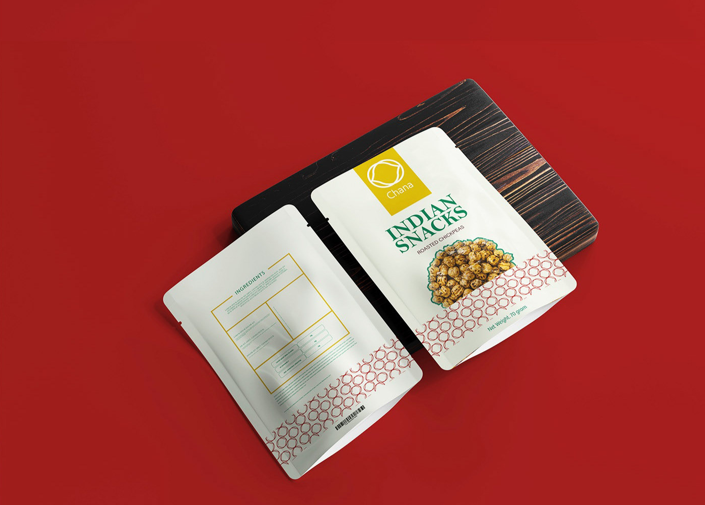
Chana is known by locals for its variety of snacks. Snacks that all have their own unique spices.
The new brand identity should clearly show the company’s Indian heritage.
But it should also have a modern twist so that it appeals to more than just the traditional Indian population. It should be simple but striking and leave a lasting impression on the customer. They wanted to stand out from the competition and have a brand image that was unique but true to their culture.
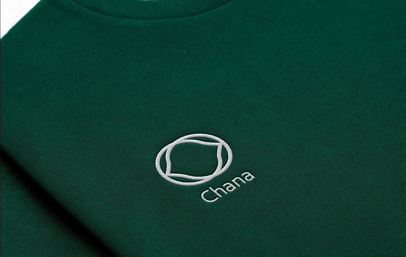
For the logo, I decided on two very simple abstract shapes of chickpeas that, when put together. It’s very memorable and will stick in customers‘ minds. For the lettering, I chose a very simple font in which the “C“ is very similar to that of the brand because of its geometric shape.
The duplication of the logo creates a very nice pattern that resembles a mandala, typical of Indian culture. It is especially beautiful on the snack packaging, as it gives the customer the feeling that he is taking a piece of the snacks home with him. He is taking a piece of Asia home with him, because the entire packaging screams India.
Green, yellow and red are typical of Asian culture and especially their food, which is loved and easily recognized by many. The green herbs, red chili and yellow curry are staples of Indian cuisine and are also used in snacks, so I really wanted to incorporate them into the corporate identity system.